Frontpage elements
- Written by: Ashraf
- Published in Template articles
- Hits: 1498
Frontpage can contain big header image if you add in the template settings (on the "Features" tab the imageBg page suffix. Additionally if you need to achieve the grey background under the mainbody, please assign to the frontpage the grey-content page suffix.
Header price table
Header on the demo content contains the color price table, which uses the following HTML code:

<div class="gkColorPriceTable col3">
<dl>
<dt>Basic</dt>
<dd class="gkPrice"><span>Starting from:</span>$ 19.99<small> /month</small></dd>
<dd>30 GB Space</dd>
<dd>100 GB Traffic</dd>
<dd>100 Mailboxes</dd>
<dd>PHP, Perl/CGI, MySQL</dd>
<dd class="gkLink"><a href="#" class="loaded">More</a></dd>
</dl>

<dl class="gkPremium">
<dt>Dedicated</dt>
<dd class="gkPrice"><span>Starting from:</span>$ 499.99<small> /month</small></dd>
<dd>5000 GB Space</dd>
<dd>5 TB Traffic</dd>
<dd>200 Mailboxes</dd>
<dd>PHP, Perl/CGI, MySQL</dd>
<dd class="gkLink"><a href="#" class="loaded">More</a></dd>
</dl>

<dl class="gkColor">
<dt>Cloud VPS</dt>
<dd class="gkPrice"><span>Starting from:</span>$ 39.99<small> /month</small></dd>
<dd>200 GB Space</dd>
<dd>500 GB Traffic</dd>
<dd>200 Mailboxes</dd>
<dd>PHP, Perl/CGI, MySQL</dd>
<dd class="gkLink"><a href="#" class="loaded">More</a></dd>
</dl>
</div>
Similary to the normal price table, you have to use at least two CSS classes: gkColorPriceTable and colX class (it defines how many columns your price table will contain - you can use classes col1 - col4).
If you want to highlight some column, please use in the dl element the gkPremium class. You can apply the second color to the price table columns using in the dl elements the gkColor CSS class.
Domain search

Domain search form uses the following structure:
<form class="gkDomainSearch" action="#">
	<label>Search Domains</label>
	<input type="text" placeholder="Start your domain search">
        <select class="gkBigSelect">
		<option value=".com" selected="selected">.com</option>
		<option value=".net">.net</option>
		<option value=".info">.info</option>
		<option value=".org">.org</option>
		<option value=".biz">.biz</option>
		<option value=".me">.me</option>
		<option value=".tv">.tv</option>
	</select>
	<input type="button" value="Search">
</form>
All elements with the gkBigSelect class are replaced with the CSS-styled UI control.
Columns in the content
We have used in a few places a simple mechanism of the columns in the content. You can create 2,3 or even 4-column layout in the single module using the following structure:
<div class="gkColumns" data-cols="X">
<div>
// … column content
</div>
...
</div>
Amout of columns is specified in the data-cols attribute and should be in range 1-4.
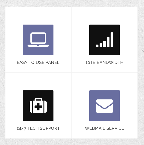
Big icons

You can create a lot of big icons with links using the Font Awesome set.
The icons should be placed in group in the .gkIcons container.
Every icon can be defined as:
<div class="gkIcon animated">
    <a href="#">
        <i class="icon-laptop"></i>
        <span>Easy to use panel</span>
    </a>
</div>
The main element contains two classes - gkIcons (necessary) and animated (optional). The second class should be used if you want to animate the icons during the scrolling.
The span element creates the optional title of the icon.
Points

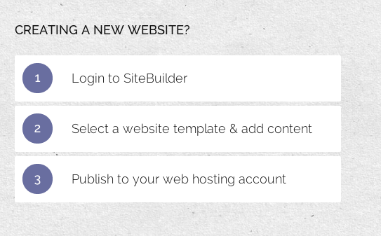
Another animated structure - points. It is a great typography element for the process description. It uses the following structure:
<ul class="gkPoints">
<li><span>1</span> Login to SiteBuilder</li>
<li><span>2</span> Select a website template & add content</li>
<li><span>3</span> Publish to your web hosting account</li>
</ul>
The structure needs just two things: gkPoints class and span elements inside every list element.
Details

If you want to put small text, you can use the small element with the gkDetails class:
<small class="gkDetails">Lorem ipsum dolor</small>
Frames

Another useful element on the hosting/service pages: block with title, description and button:
<div class="gkFrame">
    <a href="#" class="button">Live Chat</a>
    <h4>Need more power? Talk to our Live Sales Team! </h4>
    <p>Get the Flexibility,Performance and Power your business needs now.</p>
</div>
Please remember that the button should be placed as the first element (important for the responsive behaviour of the block).
Testimonials

The last and the most complex structure. Testimonials are based on two possible layouts - with and without additional links - you can enable optional links at the end of the each row using the data-extralinks attribute:
<div class="gkTestimonials" data-extralinks="on">
<div>
<div><img src="/_updates/joomla25/cloudhost/images/demo/testimonial1.jpg" alt="Testimonial I"><blockquote><p>I really enjoyed CloudHost very much, I’m looking forward to using it on larger projects.</p><strong>Company, ltd.</strong></blockquote></div>
<div><img src="/_updates/joomla25/cloudhost/images/demo/testimonial2.jpg" alt="Testimonial II"><blockquote><p>I really enjoyed CloudHost very much, I’m looking forward to using it on larger projects.</p><strong>Company, ltd.</strong></blockquote></div>
<div class="gkText"><div><p>Our customers love us.<br>We are rated 4.99 / 5.00</p></div></div>
</div>

<div>
<div><blockquote><p>I really enjoyed CloudHost very much, I’m looking forward to using it on larger projects.</p><strong>Company, ltd.</strong></blockquote><img src="/_updates/joomla25/cloudhost/images/demo/testimonial3.jpg" alt="Testimonial III"></div>
<div><blockquote><p>I really enjoyed CloudHost very much, I’m looking forward to using it on larger projects.</p><strong>Company, ltd.</strong></blockquote><img src="/_updates/joomla25/cloudhost/images/demo/testimonial4.jpg" alt="Testimonial IV"></div>
<div class="gkLink"><div><a href="#">More testimonials</a></div></div>
</div>
</div>
Every testimonial is based on the image and the blockquote element. Image can be placed before or after the blockquote element.
The additional blocks can contain two CSS classes: gkText or gkLink. The first class is prepared for the static text - you have to put an paragraph inside a helper div container. In the second case insted of paragraph you have to use a link.
Animations
If you want to avoid the animation effect of the specific elements, the easiest way to disable the animation will be adding the loaded class to these elements. Then the elements will achieve the final state added during the animation.
